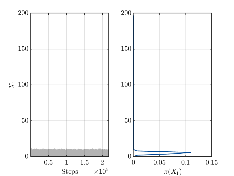
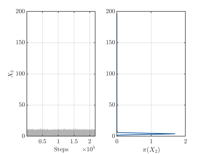
Hello,
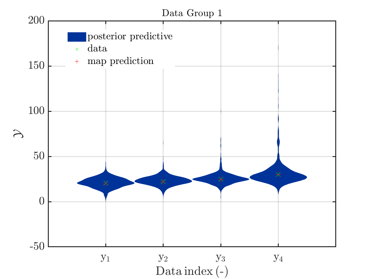
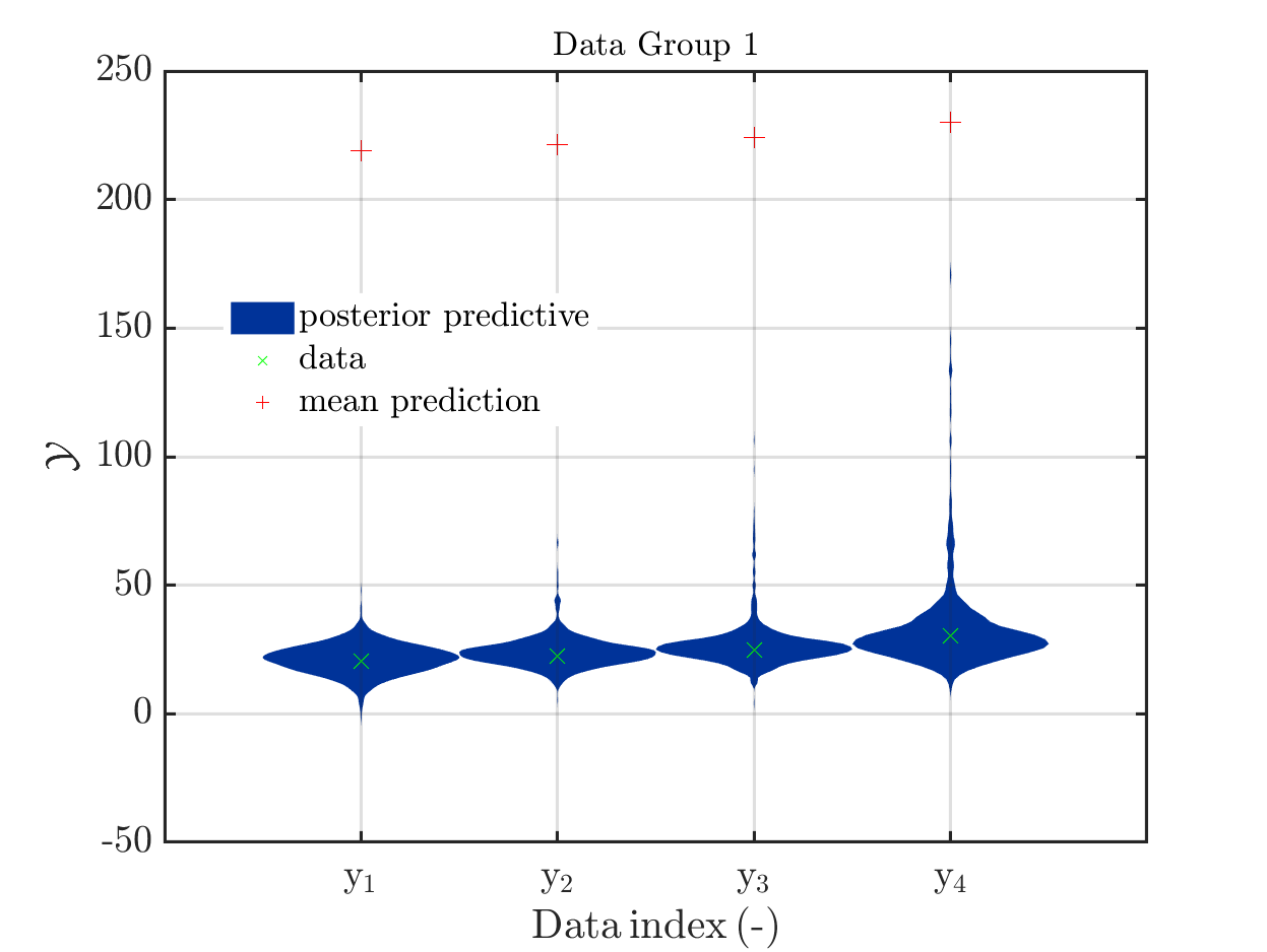
This is an example for a (incomplete) Bayesian inference computation for a model with vectorial output such that it holds for the model output at the mean of the parameter samples, which is denoted by mean prediction in the plot shown below: It holds for every component that the model output is much larger then the maximum over the values for this component in the samples for the posterior predictive density:
 .
.
I think that this example may be of interest, since in many other example the model output at this mean is contained in the discrete posterior predictive support, such that one expects that this to be a general property, as it is pointed out for example in a contribution in a discussion on UQWorld..
The model output at the mean, denoted by mean prediction in the figure above, is (218.9, 221.239, 224.162, 230.008), For the components of the samples of the posterior predictive the maxima
are (47.9056, 66.6261, 106.543, 171.66).
These numbers and this figure has been generated by the script strange_mean_prediction.m (3.9 KB) that calls the function strange_mean_prediction_func.m (592 Bytes).
To generate this surprising behavior, I used:
1.) A model with a vectorial output and positive model parameters X1 and X2 that is linear with respect to X1 and is in all components a monotone increasing function for X2. This yields that increasing the values for X1 or for X2 increases the values in the components in the corresponding output of the model. It holds for Scr_UQLab_fullsim_ldent_func that the output at (X1,X2)=(X_1,X_2) is equal to
(This model is a surrogate for the model in my real application that also has the discussed properties. Dealing with this model I accidentally created figure in my contributioon to a discusion on UQWorlld .
2.) A data vector that is created from the output of the model for the parameter values
X1 = 5 and X2 = 4 by adding some noise.
3.) For both parameters, a prior is used which is supposed to carry almost no
information and is therefore uniform on [0 200].
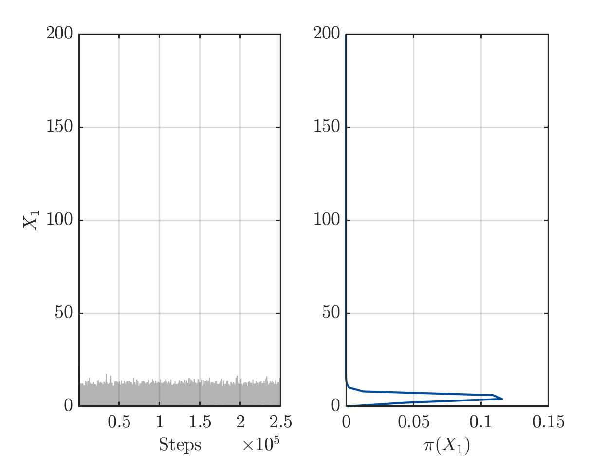
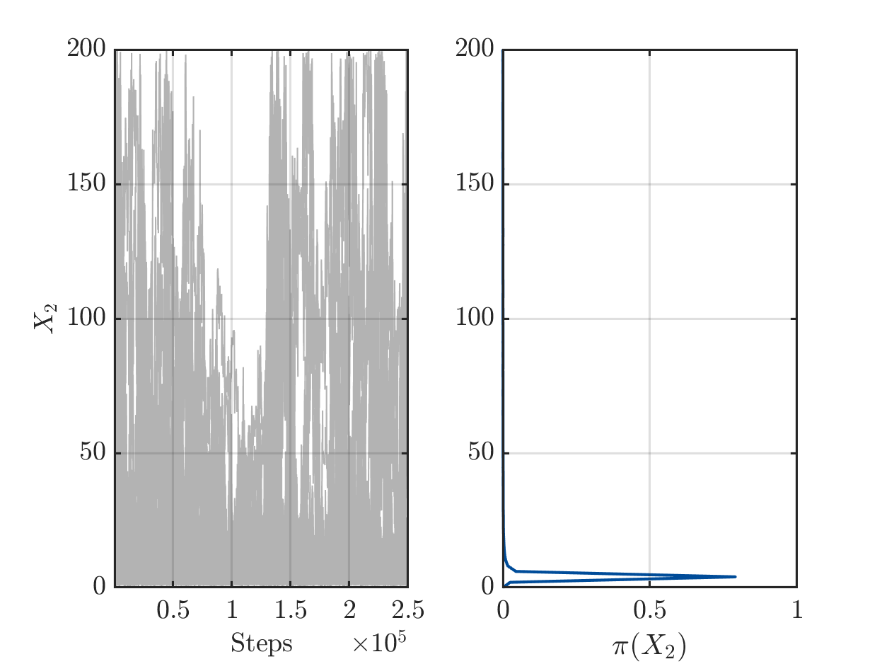
4.) After 200 of iterations steps for the MCMC algorithm is holds for the samples
derived after rejecting of the initial 50 percent of the MCMC samples as burnIn values:
On one hand there are still a sufficient number of chains with large values for X1 or for X2, see
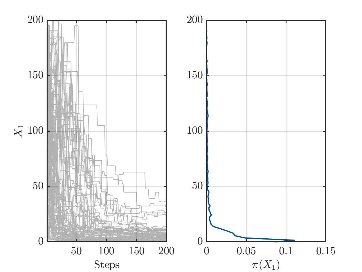
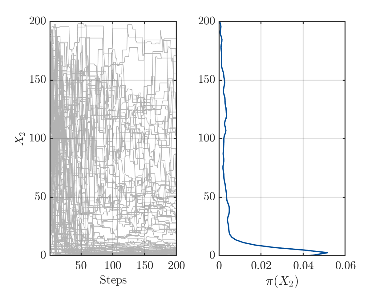
but one the other hand the algorithm has already performed a sufficient number of iterations the such the parameters pairs (X1,X2) in the samples create good approximation of the data vector.
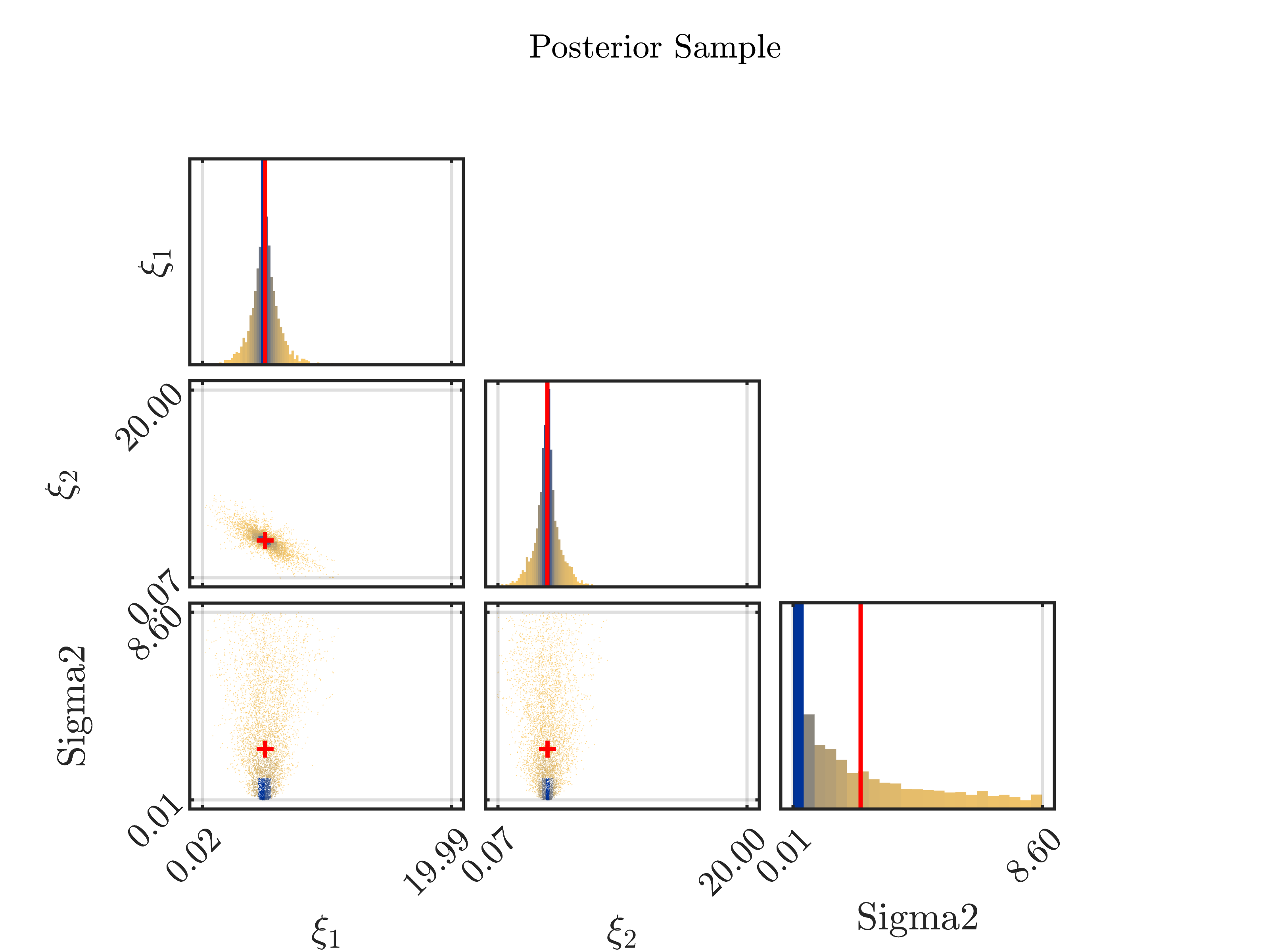
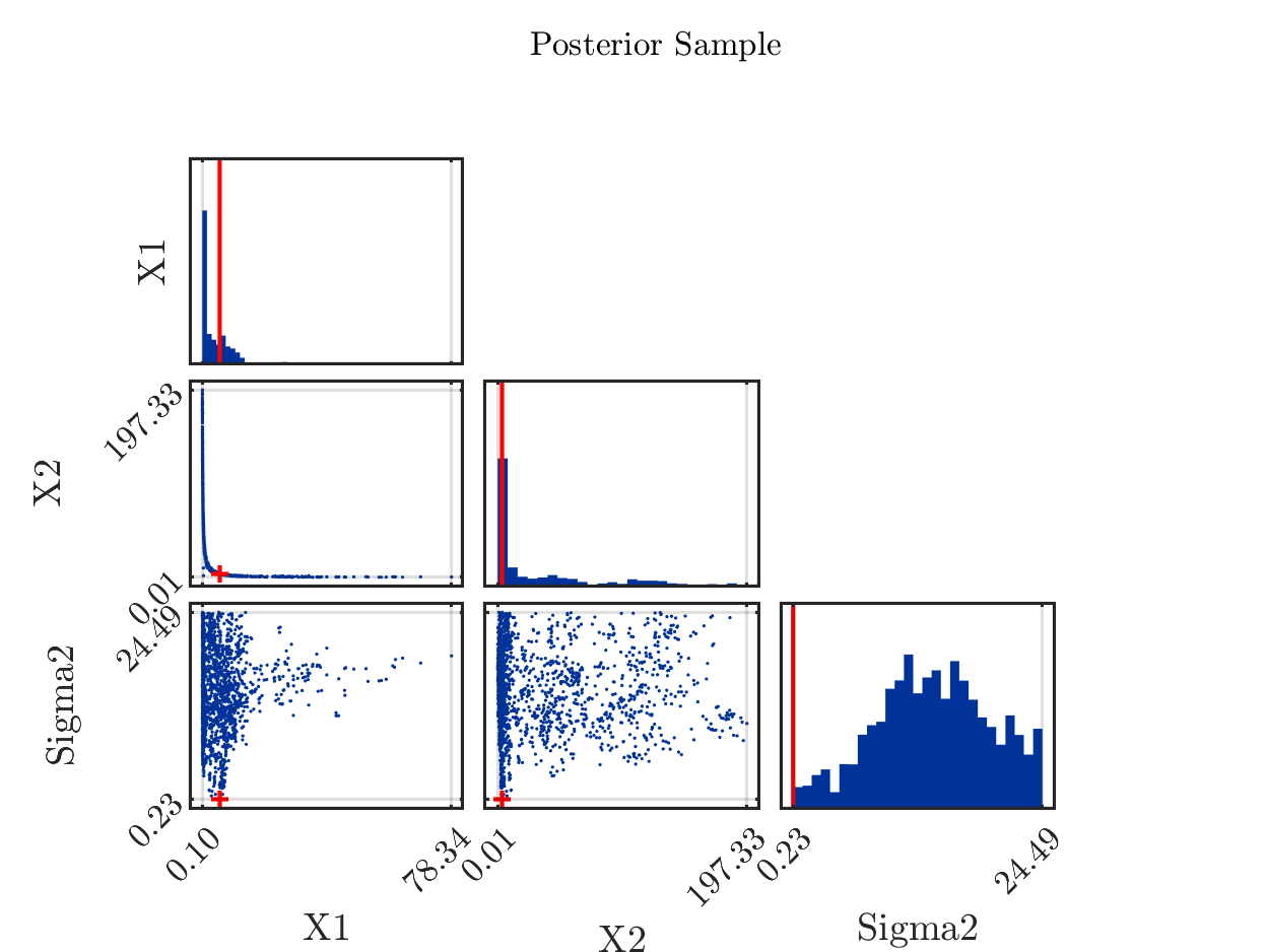
5.) The properties of the model now yield that the samples with large values for X1 in general contain a small value for X2 and the samples with large values for X2 in general contain a small value in X1. In the posterior sample scatter plot strange_mean_prediction-fig-7.png one can see
that the sample points for (X1,X,2) are on a line similar to the graph of 1/x on (0,\infty):

6) Now, it holds for the computed arithmetic means from the samples and the data pair that was used to created the to be approximated that the mean of 5.8 for X1 is slightly larger then the value of 5 used for the data creation and that the mean of 37 for X2 is much larger then the value of 4 used for the data creation. Considering the marks in the scatter plot above indicating the position of these means, one observes that both mean are larger then position of the the maximum of the corresponding discrete sample density:
Since the model output is linear in X1 and almost linear in X2, we see that this yield that the components of the model output for this mean value pair, i.e. the mean prediction in the first plot, are therefore much larger then the components of the model output at (5,4). Since the considered data vector is a noisy version of this model output and is approximated by the samples of the posterior predictive distribution, we get maximal values for the components that are smaller then the components
of the model output at the mean.
Remark: If one is replacing the mean by the maxima of the a posteriori density (MAP), being
equal to (5.6, 3.4) in considered situation, one can mark it in the scatter plot by the red cross in the (X1,X2) plot:
Marking in the it in the posterior density plots the model output at the MAP value by map prediction,
the result is is less surprising then the plot above:
