In both research or industrial applications, the visualization of the results of an analysis is essential, and can greatly improve their interpretation. After all, a picture is worth a thousand words and we do believe this not only applies to prose but also (and maybe even more so) to numbers and code. Thus, the display of INPUT, MODEL and ANALYSIS results has always been an important feature of UQLab.
Through the years, UQLab has been growing steadily, and many new features were added, each with its own display functionality. We tried to keep the visuals as uniform as possible to maintain a UQLab look in our plots. However, without some basic, central formatting functions, the ever-growing number of plots has been hard to manage. Furthermore, if users want to customize the figures produced by the display function, they have to either manually format each figure after it is created, or delve deeper into the code, which can be cumbersome and time-consuming.
uq_graphics: killing two birds with one stone
After the release of UQLab V1.2 we started to develop improved plotting tools and collected them in the uq_graphics library. This library comprises our own versions of frequently used plot functions (like uq_plot  ,
, uq_bar  , etc.). At the same time, it includes several underlying formatting functions that set the defaults for plot properties like
 LineWidth, Markers and EdgeColor, as well as the default format of the axes, color order, and color map. However, the user can modify the defaults by providing custom format specifications. You might have noticed that some of those functions were used in earlier code. However, until now they were p-coded, far less extensive and a bit impractical.
This new setup allows for two improvements to the UQLab framework. On the one hand, all display functions or plots can be cleared of formatting, streamlining the code while maintaining a unique and consistent look and also reducing the number of entry points for future changes in the graphics. On the other hand, UQLab users can now easily modify those functions to get plots with their desired format straight from the display functions. This library will be released with UQLab V1.3 by the end of Summer 2019.
Example
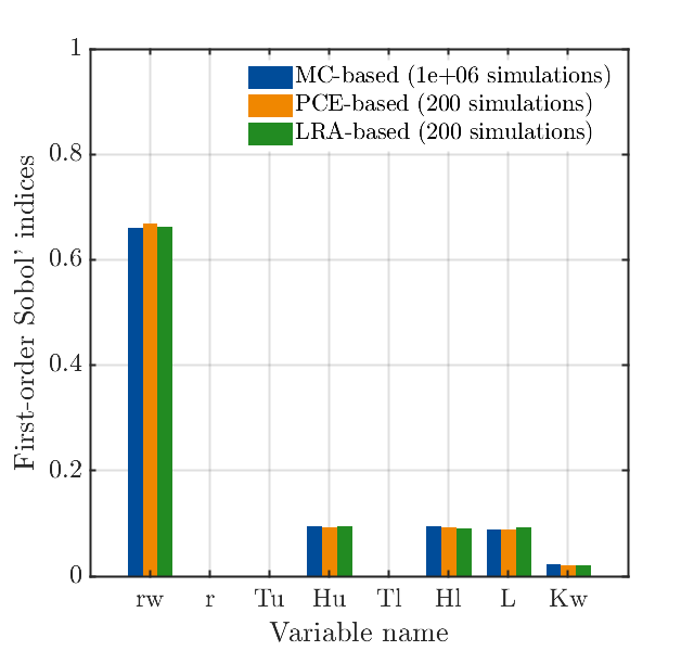
To give you an example, consider the last figure produced in the Sobol’ indices example of the Sensitivity Module. Here we draw results from three different analyses and compare them in one bar plot. In V1.2 the code for the plot looks like this:
uq_figure('Position', [50 50 500 400])
cm = colormap;  % Use default MATLAB colormap
uq_bar((1:8)-0.25, mySobolResultsMC.FirstOrder, 0.25,...
    'FaceColor', cm(33,:), 'EdgeColor', 'none')
hold on
uq_bar(1:8, mySobolResultsPCE.FirstOrder, 0.25,...
    'FaceColor', cm(1,:), 'EdgeColor', 'none')
uq_bar((1:8)+0.25, mySobolResultsLRA.FirstOrder, 0.25,...
    'FaceColor', cm(64,:), 'EdgeColor', 'none')
% Set axes limits
xlim([0 9])
ylim([0 1])
% Set labels
uq_setInterpreters(gca)
xlabel('Variable name')
ylabel('First-order Sobol'' indices')
set(gca, 'XTick', 1:length(InputOpts.Marginals),...
    'XTickLabel', mySobolResultsPCE.VariableNames, 'FontSize', 14)
% Set legend
uq_legend({...
    sprintf('MC-based (%.0e simulations)', mySobolResultsMC.Cost),...
    sprintf('PCE-based (%d simulations)', myPCE.ExpDesign.NSamples),...
    sprintf('LRA-based (%d simulations)', myLRA.ExpDesign.NSamples)},...
    'Location', 'northeast', 'Interpreter', 'latex', 'FontSize', 14)
Making use of the uq_graphics library we can cut out all the formatting getting a much slimmer code that just deals with the data and text:
% Create a bar plot to compare the first-order Sobol' indices:
uq_figure('FileName', 'FirstOrderIndices.fig')
uq_bar((1:8)-0.25, mySobolResultsMC.FirstOrder, 0.25)
hold on
uq_bar(1:8, mySobolResultsPCE.FirstOrder, 0.25)
uq_bar((1:8)+0.25, mySobolResultsLRA.FirstOrder, 0.25)
% Set axes limits
xlim([0 9])
ylim([0 1])
% Set labels
xlabel('Variable name')
ylabel('First-order Sobol'' indices')
set(gca, 'XTick', 1:length(InputOpts.Marginals),...
    'XTickLabel', mySobolResultsPCE.VariableNames)
% Set legend
uq_legend({...
    sprintf('MC-based (%.0e simulations)', mySobolResultsMC.Cost),...
    sprintf('PCE-based (%d simulations)', myPCE.ExpDesign.NSamples),...
    sprintf('LRA-based (%d simulations)', myLRA.ExpDesign.NSamples)},...
    'Location', 'northeast')
Without any manual formatting, this results in the figure below with our desired UQLab format:
Improvements in later updates
Since UQLab aims to be used by practitioners as well as researchers, easy access to its settings is important, and setting the graphics defaults in structures in m-files might not be optimal. Therefore, in future versions we will provide custom initialization files, where settings can be made in text form which can then be loaded by UQLab upon startup.
As you might know, INPUT, MODEL and ANALYSIS objects are stored in a UQLab session upon creation by the core. In the future we will consider extending UQLabCore to also handle all figures created through uq_graphics, making it easier to keep track of all produced plots during a session.
So now you know a little more about our plans with the graphics in UQLab. We constantly try to improve the software for our users, so if you have any feedback or ideas for visualizations, please let us know!